PERSONAL PROJECT
soma toma
Timeline
~2 weeks
I wanted a mixing board and pomodoro timer baby
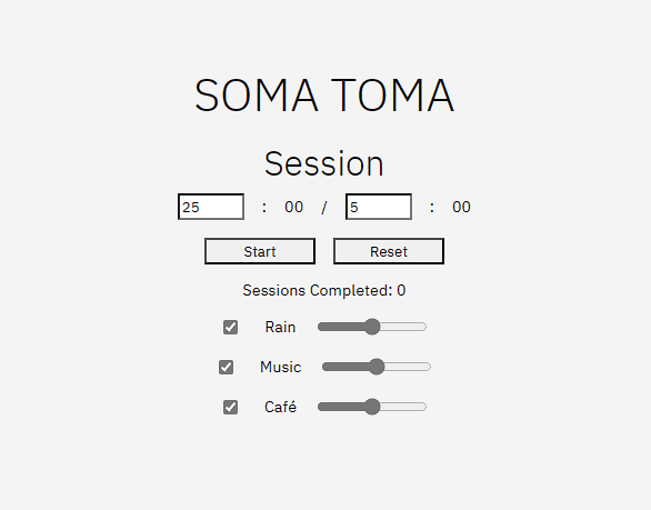
I had the idea for soma toma about a year ago when I became slightly annoyed over my music and pomodoro timer not being synced (aren't all great works a result of slight annoyances?). My idea was to have a mixing board with a few types of sounds (including one for music) where everything was synced with the timer.
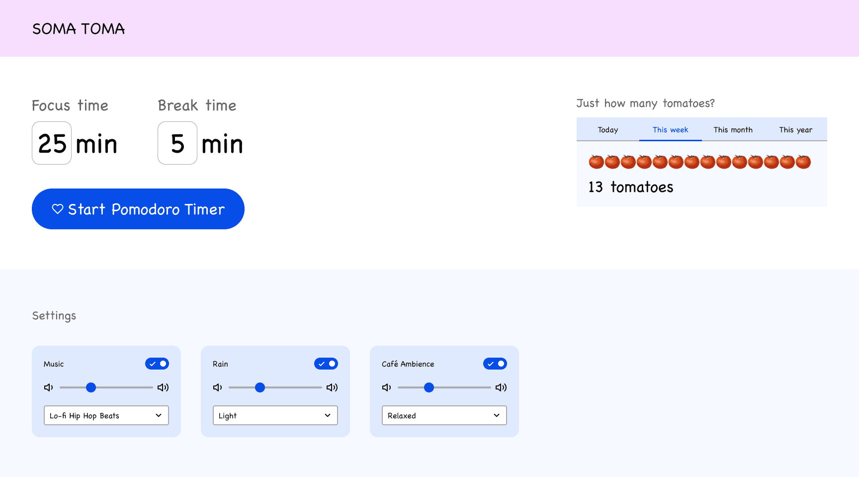
Since my programming skills are rudimentary, I had no idea how I'd pull this off, so the idea sat on the shelf. I tried a ton of timers and productivity apps over time to fill the void, and none seemed to have the right balance of simplicity and customization. If I did ever find a way to build soma toma, it would sort of fall here:
Just a simple timer
Full-fledged productivity app
soma toma
So I built it
Based on an old wireframe and general idea floating in my head, I was able to create soma toma within 12 days thanks to ChatGPT-4. Try it out while you read about it!
Iterating as Designer & Developer


Even with the first royalty-free sounds I could find, I knew instantly the core idea was solid. It felt like I was transported to an entirely different environment; one where all my productivity dreams would come true!
Part of being a designer is obsessing over details. I wanted all sounds to fade in and out when being turned on or off. After tons of back and forth with ChatGPT-4 attempting to squash bugs, I realized this was beyond mine or its capabilities. I had to move forward without audio fading.
Adding Personality to Soma Toma
Since the core functionality was there and audio fade had been nixed, now it was time to hunt for sound effects and flesh out the visual design. I spent a decent bit of time poking around the internet for royalty-free sounds, but Pixabay seemed to have the best selection.
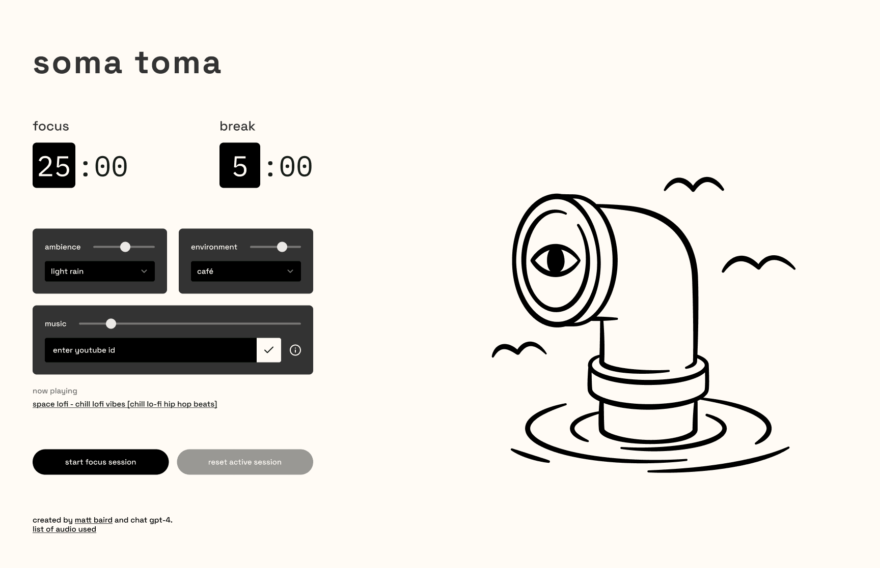
Their selection led me to reconsider my higher-level sound categories. Rain was really a kind of ambiance, and Café was really a setting or environment. Designating higher level categories would allow for variation and additional interesting combinations, like being able to hear rain in a library.

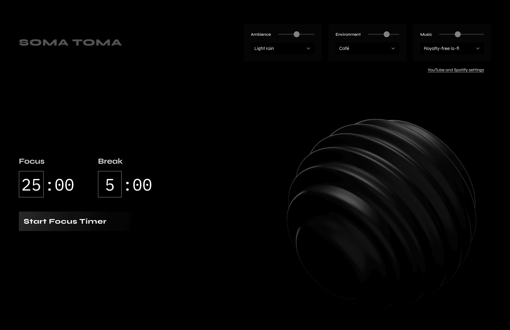
Unfortunately, I started having trouble with the video element. I wasn't able to align its background color with the css-based background color of the page, and there were issues syncing it with the audio. I wasn't happy with the file size either, since it went against the simple ethos of the app. Out of frustration, I shifted my efforts back to hunting for more sound effects.
Some of the sound effects were a little too interesting.
Who are you Daniel G
Around the time I discovered "beer foam" or "conductor announcement on japanese train", I wanted the visual direction to be a reflection of the sounds I'd be providing. I had the perfect looping Lottie animation to match the quirkiness and serendipity of how this all came together.

The result is a minimal design with subtle bells and whistles, meant to be out-of-the-way but fun when you interact with it. In keeping with the simple ethos, I decided all music should come from YouTube. Their API is perfect for this, and no login is required.
I haven't really marketed it, but I did receive a decent reaction through a LinkedIn post. Let me know what your favorite sound sandwich is! Here's the link again if you skipped it earlier.


